Monday, December 21, 2015

Pop Goes the Zentangle

"Creativity makes a leap, then looks to see where it is."       Mason Cooley

Last week I created a tile for the Square One Facebook group focus of the week. Then I decided I wanted to play around with it a little and see the effects. I love contrast and drama in a Zentangle tile, so I started blackening in the background. Loved the way it made the design pop. 

So I thought it would be fun to pull out some tiles I've already created, add some black to them and make them pop too. Some of the tiles I'm sharing here were completed in the last couple of months, and some were from more than a year ago. For each, I show a picture of the original tile (where it's been cropped in Lightroom with a black border), and then the newly altered tile (without the black border since it would just blend with the black I added to the tile.) On a couple of them I also added more to the shading... I've become much bolder with my shading over the last few months and felt that some of them needed more.

Here's the first one where I liked the way it looked with just part of the background blackened.


In the next one I added an aura around the whole design and then blackened all around.

Here's another one where I blackened the whole background. This might be a good time to mention that I did all the black with an Identi-pen, using the thick end for most of it which made it quick work to get great coverage. I used the thinner tip to fill in any tiny points.


In the one below, I filled in the centers of the Crescent Moons along with the background.

This one didn't have a lot to blacken, but those small sections still went a long way in making the design pop.

This one is a Zendala a little larger in size. I chose to only blacken a bit on this one.


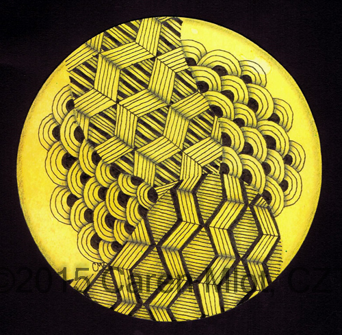
The last one was created on one of my hand-colored round tiles. I loved the combination of the black pen on yellow, and again, the extra black around the sides just made it pop even more.


In my Zentangle journey so far, it has taken me a while to feel comfortable leaving white space, rather than tangling every little spot on the tile/paper. Now that I'm finally comfortable doing that, I'm beginning to get comfortable taking that white space and converting it to black space instead. I love bold contrast, and this is a surefire way of achieving it!

It was fun to see the transformation of some older tiles. Looking for more drama in your life (speaking of the good kind of drama)? Pull out some of your old tiles and give it a whirl!


Saturday, December 12, 2015

Lucy in the Sky With Gems

"There are little gems all around us that can hold glimmers of inspiration."     Richelle Mead

If you belong to any of the Zentangle Facebook groups, you've probably seen that "gems" have been the hot topic recently. I decided to give them a try, not really expecting much, but I was pleasantly surprised at how easy they really were to draw, and how realistic they look.

I used Prismacolor colored pencils, 3 or 4 shades in each gem. Normally I don't do a lot of colored pencil work because I find that it is very labor intensive due to all the layering and blending that needs to be done. I once colored a large piece with colored pencils and it took me forever! But it didn't take too long to just color the gems in these pieces that I'm sharing here. 

This first one just has lots of line work... back and forth, getting in the flow, never lifting the pen except to change the direction of the lines. Very soothing.  


Next, I decided to try a flower, with a big gem in the center.

Patterns used: Betweed, Sand Swirl, Diva Dance, Hypnotic, Fassett, Huggins, and Navaho.

I wanted to see how it would look with color added to the outside border of the flower, so after remembering to scan the one you see above, I added purple in the border.


I'm not sure which way I like it better. What do you think?
All the while I was working on the flower I had another vision forming in my mind, which you see below. I love the way this one turned out, full of bright, shiny color.


Patterns used: Purk and Squid


That's where I intended to end this post. However, I had another piece sitting in the corner of my desk, half finished. I started it with small size gems, and found that I really didn't like working in that small of a space with the colored pencils (you'll notice in the above pieces all the gems are larger in size.) I almost threw this one away, but at the last minute decided to go ahead and complete it.


Patterns used: Arukas and a tangleation of Fassett

I'm glad I didn't throw it away, but it's definitely not my favorite of the batch. The gems were a lot of fun to do, and I expect that they'll be popping up in my art work from time to time.

**In case you've been living under a rock and have NOT seen these gems before, here is a helpful video by CZT Chris Gerstner, on how to create them.


Thursday, December 3, 2015

Paradox

"The curious paradox is that when I accept myself just as I am, then I can change."    Carl Rogers


A couple of weeks ago, the Square One Facebook group had the tangle pattern Paradox as the focus for the week. I don't always have the time (or the desire, depending what the focus tangle is) to create and post anything, but Paradox is one of my favorite patterns so I knew I'd be participating that week. I'll save the two tiles I did for that group until later. But first I wanted to show you a couple of pieces I created that didn't follow the guidelines for the group (3 1/2 inch square tiles in black and white.)

For this one I chose one of my hand-colored zendala tiles, even though I wouldn't really call this a zendala. Sometimes I just love working on the round tiles. I drew some lines to form a string, and where you see black I had expected to leave blank so it would be pink. But sometimes I can't leave well enough alone, and in one spot I brought the Paradox out into the pink space....and was not at all happy with it. I tried a couple of things to make it better, but in the end all I could think to do was fill in all those spaces with black. Well... a happy accident... I really like the way this looks! Just Paradox and black (filled in with the fat end of an Identi Pen.)


The next one was drawn on a pre-strung Rennaisance zendala tile. I'm really happy with this one also. I always love bringing the tan tiles to life with white highlights. A brown pastel pencil and a graphite pencil were used for shading.


Patterns used: Paradox, Static, Munchin, and Maryhill


The following two tiles were the ones I posted on the Square One Facebook page, so if you're a member of that group you may have already seen these.


Patterns used: Paradox, Petales de Fleurs inspired Munchin


Patterns used: Paradox and Tipple


I just want to leave you with this last piece of pure Paradox, laid out totally randomly, and then colored digitally with some green.
I love, love, love Paradox!

Tuesday, November 24, 2015

Color on Tan

"Life is art. Live yours in color."    Unknown

I'm experimenting with color on a tan background. For the tiles I'm sharing today, I used Strathmore tan toned paper. And for the color, I used pastel pencils, my favorite way to do color these days. My first piece was drawn with a green Micron pen. Color was added using three shades of green pencils which blended together beautifully. I love the way it turned out.

Patterns used: Mooka and Shattuck

 
For the next one I tangled with a black Micron pen. Then I used a combination of two green pencils and two blue, to add the color. I don't like this one as much as the first, but it's okay. 

Patterns used: Hamail, Pokeleaf, Zinger

I love being able to use white highlights on the tan paper. I'm looking forward to trying out some other colors too.

Wishing everyone a happy, tangled Thanksgiving. Don't eat too much!


Sunday, November 15, 2015

What's Black and White and Colored All Over?

"Be the most brilliant color in the box."    Unknown

Several weeks ago I blogged about using Dyan Reaveley's acrylic paint to make some colored "tiles." You can see that post here and read all about the paints and how I used them. I had two more tiles left over from my play date with the paints and it was time to go back to them. Here's the first one, where I used sponge daubers and black ink the same way I did on the tiles shown in my previous post.


I decided to use those black spots as part of the pattern Cadent, and attached them to make a string for the rest of my tangling.  This is what I ended up with.


I really liked it, but even though I used a thicker Micron 08 pen for drawing the Cadent string, it basically disappeared among the other tangles. So I added some white pen embellishments to make the original Cadent stand out.


Patterns used: Cadent, Diva Dance and Fassett

I love the way the white pops out against the black pen and red/pink background.

Here's the next tile before tangling.


I added white embellishments to this one also.

Patterns used: Crescent Moon and Frost Flower

I'm very happy with both of these. They were the last of my Reaveley colored tiles (at least the ones I liked), so I will have to pull out the paints and work on some more.


Thursday, November 5, 2015

Presenting Zigbee

"Success is following the pattern of life one enjoys most."    Al Capp

In March, 2014, I published an e-book, Step Out in Style, with 40 new tangle patterns - mostly my own, but also with contributions from other CZTs. The book has been very well received, and I'd like to thank those of you who have purchased it. I called it Volume 1, leaving the door open for me to possibly do a Volume 2. For the last year and a half I have thought about it, and finally came to the decision that I will NOT be creating another volume. However, I do enjoy coming up with new patterns, or at least what I think are new patterns, as there are SO many out there that I can never be sure.

So... from time to time I'll be blogging about a pattern for which I've created the step-outs. Today is the first one. This pattern begins like Beeline, a pattern from Rick Roberts and Maria Thomas, founders of the Zentangle Method. But in the end, it looks totally different. I love patterns with lots of repetitive lines, and if you are a fan of those patterns also, I think you'll enjoy this one. Of course I'm hoping that you all like it, even if you're not crazy about lines like I am. 

I've decided to call it Zigbee. Zig for the zig zag lines, and bee for the fact that it begins like Beeline. Here are my step-outs.


First, a couple of notes about the pattern:
  • In step #3, after you have drawn your first column of diamonds, move over to leave some space, and aura the the right side of your diamond. Do NOT draw your next column of diamonds right next to the first one. Remember to do that after each column of diamonds.
  • In step #7 I show one way to shade Zigbee, but you may find your own way of shading that you like better. Sometimes shading can totally change the look of a tangle.
  • In step #8 I show a tangleation (variation) of Zigbee. Notice that I have drawn the lines in the spaces surrounding the diamonds in different directions. This brings out the star shapes in the pattern, which I have heavily shaded here to make it easy for you to see.

I'm sharing several tiles I created as I was playing with the pattern, showing some of the different results you get based on shading, filling, and changing line direction. These are not in the order I drew them, but I do have my reasons for showing them this way. 

Here's one on a zendala that I colored using Ranger distress ink pads. In case you're interested, my colored tiles are for sale in my Etsy shop. This is the unshaded tile, showing two variations of Zigbee that look a bit different because I chose to blacken different areas.


This is what it looks like after being shaded.


The next one shows how to make star shapes really pop out by drawing the lines as shown in my tangleation in the step-outs, as well as creating black stripes in the stars. Notice that on the left side of the tile I used all straight lines, and on the right side I curved the lines to make it puffy looking.


In the tile below, I again drew the lines as in my tangleation, but this time just used shading to make the stars (partial stars) pop a little. This is one where your eyes can really play tricks on you. Focus on the tile one way and you will see the stars pop, but keep looking and your focus may change so that you see cubes popping out instead.


I did one more on a Renaissance (tan) tile. Here I used both black and brown Micron pens, graphite and brown pastel pencil for shading, and white pastel pencil for highlights.


And there you have it - Zigbee! I hope you enjoy the pattern. Have fun playing, and I'd love to see what you create with it. 


Saturday, October 24, 2015

Orange is the New Black

"I'm pretty lazy when it comes to creativity. I just want it to be easy and fun."    Reggie Watts

I was in the mood for a Zendala. An easy Zendala. One that was already drawn so I didn't need to do the designing. Sometimes it's nice to just be lazy.  So I pulled out a book I have called "Mandala Designs" from Dover publications. The first half of this book has designs with spaces perfect for tangling, while the second half has intricate designs appropriate for coloring, but not tangling. This is the one I decided to work on .


Since it's October and Halloween is approaching, I chose a piece of Canson Mi Teintes paper in orange and transferred the design onto the paper. Here's a picture of my tangling (I had to keep reminding myself not to fill every bit, leaving some white space, or in this case, orange space.)

Patterns used: Wigwam, Dex, Fassett, and some orbs

Then I added shading and decided to make it deep, dark, bold shading to give the Zendala a spooky kind of look. I hope that's what I've achieved here.


It's that time of year... watch out for the witches, ghosts and goblins!


Sunday, October 18, 2015

Munchin Crunchin

"The natural urge when running a distance is to push harder and finish sooner - to race against time. Every second behind a deadline is a little defeat."          
 Joe Henderson

I'm rushing to get this blog posted. It's my entry for the Diva's challenge this week, and this week is about to end. The challenge was to use the tangle pattern Munchin, one of my favorites. So I knew I wanted to do at least one tile, but the week flew by and I didn't get much of a chance. Finally... here it is, unshaded.


Patterns used: Munchin, Flux and Tipple
 
I figured that Munchin is a pattern that flows pretty quickly for me, and doesn't take me long to draw. It took much longer for me to go back in and do the Flux and Tipple, and especially the shading. Here's the final tile, which I'm really happy with.


Phew! I finished before next week's challenge is out!


Thursday, October 15, 2015

Tangling Tempting Templates

"A work of art is the unique result of a unique temperament."    Oscar Wilde

It was time for tangling some more templates from Ben
Kwok. If you're not familiar with him, check out his Facebook group "Ornation Creation." Each week he posts a different template for your tangling enjoyment.


This first one is, obviously, a jellyfish. I decided to use some new Stonehenge paper that I bought, and this is the color they call Fawn. I knew it would be great for drawing with my brown micron pens and adding highlights. Of course my intention was to show you a photo before I did any shading, but in my excitement to get started (because the shading is what brings it to life), I forgot to get a picture. Luckily I caught myself before I got very far, so here you see just the very beginnings of the shading.

 Patterns used: Papyrus, Printemps, Betweed

As you can tell in the following photo, the shading and highlighting, which I did with my pastel pencils, makes such a huge difference in the look. I think the shading in this one took longer than the tangling did, but it was well worth it!


Here's another one of Ben's templates... one of my favorite foods!


Patterns used: Navaho, Emingle, Static, N'zeppel, Crescent Moon, Heartstrings, Prestwood, Munchin, Paizel, Printemps, and some line work

And again with shading...


Next time I'm in the mood for template tangling (try saying that 5X fast!) I know there are LOTS more templates waiting for me over on Ben's Facebook group.


Thursday, October 8, 2015

Reflections of an Alcoholic

"Color is my day-long obsession, joy and torment."    Claude Monet

It's been about 3 months since my last post about tangling on alcohol ink. You can see that post here if you missed it. I still had several colored "tiles" all inked and waiting to be tangled. Here's the first one I decided to use this time around.


Since there were obvious circular shapes on this, I thought I would tangle each of those circles. As I was working it began to take on the look of flowers, so I went in that direction. I added stems and ended up with this little flower garden.

Patterns used: Arc Flower, Floral, Garlic Cloves/Bloom, Dandi, Betweed, Steffi, and some lines.


Then I picked another "tile" with circular shapes, figuring I'd stick to a theme. I particularly love the colors in this one.


Again I tangled in the circular shapes, but did not turn this one into flowers.

Patterns used: Z-trik, Crescent Moon, Sand Swirl, Printemps, and some lines.


I loved the colors, loved the flow of my Microperm pen on the Yupo paper, and am pretty happy with the results. This is not the last you will see of my alcohol ink creations, because I still have even more inky "tiles" all ready for tangling whenever I feel the urge. 


Saturday, October 3, 2015

Illusions

"Don't part with your illusions. When they are gone you may still exist, but you have ceased to live."     Mark Twain

According to Wikipedia, Op art, or optical art, is "a style of visual art that uses optical illusions." The style is abstract, typically done in black and white, and often gives the illusion of some kind of movement. Black and white... just like Zentangle art. Abstract... just like Zentangle art. Striking contrast that I love. After all, isn't it really just a form of the tangle pattern Knightsbridge? No wonder I'm so drawn to Op art.

So I decided to try making some of my own pieces. First I studied photos in books I own as well as on Pinterest, analyzing them to figure out the method behind the madness, as the saying goes.

Here's the first one I created, on a Zendala tile (I love using the round tiles for all kinds of Zentangle art, not just Zendalas.)


Those tiny spaces in the center were tough, as they began to run together. Not bad for my first one, but I'm not sure I'm loving the zig zags on the sides. I tried several more, all of these on the square Zentangle tiles.


I'm not sure that I got "movement" on any of them, but they're interesting nonetheless, and I'm happy with the results. It was relaxing filling in all those spaces with the pen (using the graphic Micron for most of it.) In case you didn't know, I love contrast, and these sure do fill the bill for that!

FYI... no rulers or compasses were used for these. They were all created freehand. Not perfect like a digital drawing would be, but not too bad. Hand-made art is not supposed to be perfect.

I definitely want to experiment some more with Op art, but have other things I'm off to do now. Hope to see you back here soon.

Tuesday, September 29, 2015

Bright and Beautiful Colors

"Never be afraid to try something new because life gets boring when you stay within the limits of what you already know."    Unknown

For a while I've been a fan of Dyan Reaveley - her art and her products, sold under the name of "Dylusions". If you're not familiar with her, just google her or go to YouTube and you'll find LOTS! What attracts me to her work are the vivid colors and whimsy. I own most of her ink sprays, and have used them to make colored tiles. However, things tend to get quite messy when I use them, and there is lots of cleanup, especially on my hands. And one thing you should know about me is that I am a clean artist. That's one reason why I love Zentangle so much... there's no mess.

Some time ago - I'm not sure how long it's been - she came out with a line of "blendable acrylic paint." I was reminded of the paints recently, and started looking into them some more. With some advice from other CZTs, and armed with lots of info I found online, I decided to order them. They come in 12 colors, I think, and I ordered 11 of them (I'm not a big fan of brown). There are white and black, and the rest are beautiful, bright colors that match her ink sprays. 

Dyan's video that I watched and loved is here. She uses baby wipes and her hands to paint with. That sounded intriguing, and since she kept saying how easy it is to wash/clean up, I decided to give it a try. 

I cut up various papers into rectangles approximately 3 x 5.5 inches. I gathered my paints, baby wipes, and paper towels and got to work creating a number of "tiles". As in any new endeavor, I didn't love them all, but did end up with several that I liked. Here is the first one I decided to tangle.


I created the small black circles using a stencil, and the larger ones using a small sponge dauber. Then I added my tangles.


 Patterns used: Crease and Frosty

I was going to let the shades of paint be the only shading, but I decided to give it a try with graphite. First I had experimented with colored pencils, which is normally what I would use to shade a colored tile, but didn't like it. Here's the little bit of graphite shading I added. I'd be interested to know if you really notice a difference, and if so, which you like better. 


On the next "tile" I added the border using a stencil of flames along the edges.


And then I tangled and added shading.


Patterns used: Olb, Arukas, and Tipple.

I had to fight with myself to leave that space in the upper right corner open, without tangles. I love open space but find it hard to leave it that way.

Final verdict? I LOVED working with these paints, for all the reasons Dyan points out in her videos, and more:
  • the paints are smooth and liquidy
  • the colors are beautiful
  • I love the striking contrast of the colors with my black pens
  • they spread amazingly well with a baby wipe - no streak marks
  • quick drying so I can tangle on them right away if I want
  • they blend very well (and yes I did use my fingers for that purpose)
  • they wiped up off my craft mat with a DRY paper towel
  • they came off my fingers mostly with just soap and water, and a quick swipe with my craft scrubbie
  • they were very neat to work with, compared to sprays

Is that enough reasons to convince you to go out and try these paints if you haven't already? I think so. And if you do, let me know what you think.