Showing posts with label journal. Show all posts

Tuesday, April 28, 2015

Stacking the Deck

"Creativity is intelligence having fun."   Albert Einstein

A few weeks ago the prompt for the journal group I belong to was to create a stacked Zentangle. A stack is "rows of tangles that go in the same direction and touch or are close enough to appear as one solid cohesive piece rather than an assemblage whose pieces could float away. These rows in the stack may be vertical, diagonal, horizontal, circular, or semi-circular." Below is the piece that I tangled for that prompt. It isn't shaded because I knew I was going to take it one step further by adding color.


Patterns Used: Baton. Emingle, Knightsbridge, Hollibaugh, Printemps, Sand Swirl, Dex, Purk, Betweed

Here it is after adding color and shading with Tombow markers. I think some sections came out better than others.


Shortly after this, two CZTs, Alice Hendon and Jane Eileen, started a Facebook group called Zentangle: Stacked and Tangled. A place to share only art work that follows the above definition (as stated in the guidelines for the FB group.) Since I had really enjoyed doing the stacks in my journal, I decided to join the group.

Here is a stack I completed on a Zentangle tile (3 1/2 inches square). I used a stencil from Acadia Laser Creations and filled the open sections between stacks with Tipple (the little circles.)


Patterns Used: Knightsbridge, Z-trik, lines, Gerwutz, Static, Shattuck, Copada

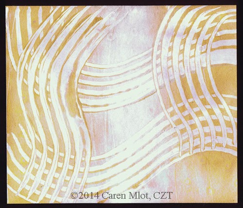
Then I used another stencil from Acadia Laser that is similar, but meant for a Zendala tile. This time I chose a Renaissance tile and used brown and black microns with graphite pencil, brown pencil, and white pencil for the shading and highlighting. The knightsbridge (checkerboard) filled the spaces in between.


Patterns Used: Footlites, Beelight, N'zeppel, Diva Dance
 
It never fails to amaze me how the tan tiles come to life with the different color pens and pencils. Stacking is fun and simple to do. Check out the Facebook group linked above and see what it's all about.

Wednesday, March 11, 2015

Evolution of a Zendala

"Creativity is just connecting things.When you ask creative people how they did something, they feel a little guilty because they didn't really do it, they just saw something."   Steve Jobs

A couple of weeks ago the prompt for the journal group I belong to was to do something that shows our strength, something we are good at, something we love to do. Since one of my favorite things to do with Zentangle is Zendalas, that's the direction I headed in.

I began with a stencil from Genevieve Crabe (Tangle Harmony) which you can check out here. Her stencils are made from sturdy plastic with lots of holes in them. You draw a dot in each hole and then connect those dots in whatever way you want to create a template for a Zendala. Very simple method, but some trial and error until you get the design you want. Usually I do a bit of erasing and changing my lines; however, this time I hardly did any of that. I took a picture of the template before tangling (yay for remembering to do that), but somehow that picture seems to have gotten lost in cyberspace (have I mentioned how frustrating I find computers?), so I have no pre-picture to show you.

However, I do have photos of the steps during my tangling process. Where you see the 'x' marks, that is a note to myself not to tangle there, since I decided those sections would be my white space. I began with the tangle Fassett by Lynn Mead.


In the next picture you will see that I changed my mind and rounded those outside spaces rather than leaving them pointed. I think that was a good decision. I added a pattern called Petales de Fleurs but unfortunately don't know who to credit for that pattern.


This is the point where I got very nervous. I really liked what I had so far and was scared to death of messing up as I continued. Some of you can probably relate to that feeling! But I forged ahead, after much debating what the next pattern would be, and added my own tangleation of Paizel, by Angie Vangalis. 


Between the Paizel sections I wanted something with a lighter, simpler look, so I did this variation of Florz, using circles at the intersections rather than diamonds. This may be a pattern with a different name, but I'm not sure.


Finally I drew Diva Dance (Rock 'n Roll) in the center. I began in the outer ring of the center and was planning to leave the small circle in the middle open, but changed my mind as I drew.


There you have it. My completed Zendala with no disasters along the way. But of course, in my mind, almost no Zentangle, or ZIA, or Zendala would be complete without shading to really bring it to life. So here is the final Zendala shaded. 


Did I say that was the final Zendala? I lied. I had to try adding some color. Here was the first part.

And then with some more color.


That's the really final Zendala. I might like the black and white one better. What do you think?


Saturday, March 7, 2015

A Little Birdie Told Me

"A bird doesn't sing because it has an answer, it sings because it has a song."    Maya Angelou

On my way home from a recent trip to Florida, I stopped in Savannah. Although Savannah is a great city, one of my main reasons for making a stop there was to go to Dick Blick (as well as Leopold's, a wonderful place serving up delicious ice cream, a couple of blocks from Dick Blick). Those of you who are artists of any kind will understand why I would make a special stop there. And for those of you who don't know Dick Blick, take my word for it, the store is an artist's paradise. 

One of the things I picked up during this stop is a journal called "Avian Friends Activity Journal." It has some pages for writing, some for coloring, and some with pretty borders or cute pictures in the corner, for tangling on. Well, they're not necessarily for tangling, but that's how I choose to use them. Here's what I created on the first page I did. It started with that cute bird, mushroom, and flower in the bottom corner, and I added the rest.


I had a lot of fun doing this and love the way it turned out. The paper is tan toned, so I was planning to add white highlights like I have done on the tan toned paper from Strathmore, but for some reason the white doesn't really show up well on this paper. You can see it's very faint on my drawing. I tried both white charcoal pencil and white Prismacolor pencil, but neither really stands out. Maybe it's because the paper is a little smoother than the other papers I've worked with. Oh well... I'm still happy with it. (The white going up the right side of the page is just the way it scanned...it didn't lay perfectly flat on the scanner because of the binding.)

Here's a picture of my journal. I don't know if all Dick Blick stores carry it, and I couldn't find it on dickblick.com, but I did see it on Amazon in case any of you are interested.


Wednesday, February 11, 2015

Blinded by the Light

"Color is to the eye what music is to the ear."   
 Louis Comfort Tiffany

The journal prompt for the Facebook journaling group I belong to was very interesting this past week. Adopt an artist.... not literally of course, and recreate a piece of their work. After giving this some thought, it suddenly came to me like an epiphany. Tiffany (hey, that rhymes!)... Louis Comfort Tiffany... stained glass artist extraordinaire. I used to create stained glass art myself (many years ago in another lifetime), so he would be the perfect choice. 

Before I show my process, here is a picture of the final piece, along with a quote from Tiffany.


First I pulled out a book I have about the artist, and found a picture of a lamp that had pieces big enough to.... do what, you ask? Well, tangle them, of course! This is the photo of the lamp from the book.


I traced the lamp onto a piece of tracing paper and then rubbed pencil all over the back of it, laid it on my journal page, and traced over all the lines with a ball point pen. This transferred all the lines onto the journal page. Here's the beautiful piece of tracing paper.


Once all the lines were on the journal page, I traced over them (again) with black pen. I chose to use the fat end of my Identi-pen to make thicker lines that look like the lead in stained glass. Here's how it looked at this point.


See those faint lines at the top of the lamp that I did not trace over in black? Those gave me the general idea of what the lights looked like in the lamp (refer back to the above picture from the book to see what I mean.) That was the scary part... figuring out how I was going to draw in those lights... not as easy as the rest of the lamp. So I just put that out of my mind temporarily, and went on to color the pieces of glass, trying to match my colors to the original as best as possible. Using alcohol markers, along with an alcohol blender pen, I attempted to make the pieces look mottled like the glass. I was quite happy with the way that worked out!


But then I had to figure out how to do those lights at the top. Knowing that if I tried to recreate that by hand I would mess up my whole project, I decided to make a copy of the lamp from the book, cut out the top portion, and glue it onto my lamp in the journal. Yay! It actually worked. Except that my lamp looks a little warped because it wasn't an exact match.


Finally the tangling began. I chose tangles that were open and airy as opposed to ones that had black spaces in them. I wanted to allow all the light to shine through! And I only tangled the flowery sections, not the leaves, as I was afraid some of the greens were too dark to really allow the tangles to pop out. Here's the final piece, except for the quote that I added (see the first photo above.)


All in all, I was pretty happy with the way this turned out. If only I had known about Zentangle all those years ago, I could have actually tangled on the glass pieces I made. Now that I think about it, I still have just a few of those stained glass  pieces around... I may have to pull them out and give it a try.


Tuesday, January 20, 2015

Snowflakes Keep Falling on my Head

"Being unique is better than being perfect."    Unknown

Last week there was a new prompt for the Zentangle art journaling Facebook group I belong to. It was all about cutting a snowflake from paper using your initials as the pattern. The theme for the week was uniqueness....just like each snowflake is unique, so is each person.

I was a little intimidated by the snowflake directions, but I gave it a go.  My first problem was that when I folded my paper, it didn't work out the way it was supposed to. The directions weren't hard to follow, but something just wasn't lining up properly. So I did the best I could, and continued. Here is the snowflake that I ended up with, using my initials, CEM. See that point at the top? Well, there should have been three of those, but the other two got cut short, I can only assume because the folds hadn't lined up properly. I figured I could tweak that when I traced the snowflake and add the other two back in. But something else kept nagging me...why does my snowflake look like it has three points instead of six? Since the theme is about being unique I decided to just go with it...mine would certainly be unique!

The center part was also not very symmetrical, so I tweaked that some after tracing the snowflake into my journal. This was going to have to be spread over two pages since my journal wasn't big enough, so the line you may notice down the middle in the photos is the center of the journal pages. Once the tracing and tweaking were done, I tangled.

As I was tangling I realized that I should have done the background before tracing the snowflake on the pages, but too late for that now! I'd have to figure out how to liven up the pages in some other way. I chose to add color to the open spaces of the snowflake using my Tombow markers - two shades of green and two of blue. I was pretty happy with the way that came out (i.e. I did not mess up after all the time spent tangling!), so things were beginning to look up.


Next I chose a quote about being unique and lettered that with an 08 Micron. Then I added some color to the letters with two of the Tombows I had used before. Of course I tested the lettering on scrap paper first, as well as the color outlining. I penciled the letters on the pages before adding the ink...no room to mess up now! But I felt like the pages needed something more to finish them off. Using a Dylusions stencil and Ranger distress ink pads, I added blue and green circles/dots around the edges. 


One last finishing touch was adding some sparkle to imitate the frosty look of a snowflake. For this I used my clear Wink of Stella glitter brush over the colored sections.  I took a close up picture so you could see the shimmer better.

All in all, I must say that I'm pleased with the look of my very unique snowflake. What I anticipated being a disaster didn't turn out so bad after all.

Sunday, January 11, 2015

My Tangled Life

"Whatever you are, be a good one."   Abraham Lincoln

This year I am participating in a Facebook group called "Our Tangled Lives." It's a group for art journaling combined with Zentangle (along with whatever else you want to include). I figure this will be a good opportunity to use some of the art supplies in my stash, that have been patiently sitting on my shelves. There will be a new prompt every week, and the prompt for this second week is "Choose an existing poem or quote, or write words that reflect your current beliefs/hopes/wants for your artistic practice." 

I chose the quote, "Whatever you are, be a good one," from Abe Lincoln. My feeling is that whatever you do, whether in art, your job, your family, or life in general, you should put your all into it, and not do it half-heartedly. A suggestion for the journal page was to frame the quote in some way. That made me think of a gelli plate print I did a few weeks ago, where the lines kind of framed an area where I could include the quote. Here's a picture of the print, which I had to cut down to fit into my journal which is 5 x 8 1/2 inches. This was printed using gold and silver acrylic paints, although the silver looks a little more like white in the pictures. In case you missed my post last month about tangling on gelli prints, you can see it here.


I drew Knightsbridge (checkerboard) to emphasize the frame, added some more tangles, and here is my page which has since been glued into my journal.


I'm sure I'll be posting some more of my journal pages as the year goes on, but in the meantime, remember...Whatever you are, be a good one!